Independent Authors - Answered
Everything you need to know about printing your book - from first draft to final delivery.
When it comes to printing, the golden rule for artwork resolution is 300 DPI (dots per inch). This ensures your images look crisp, clean, and professionally detailed on paper.
Whoa there, cowboy. Hold your pixel horses. That's not how resolution works.
Think of it like trying to turn a single slice of cheese into an entire pizza just by... stretching it really hard. The more you pull (or the more you try to artificially "create" resolution), the holes get bigger, the cheese gets weird, and it just becomes a pixelated disaster.
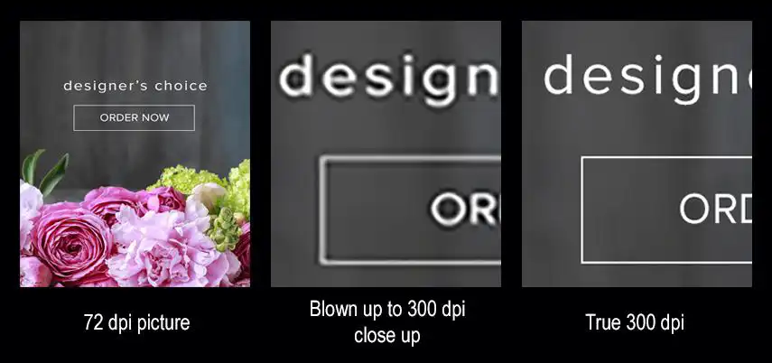
You can't create detail that isn't there in the original image. Low-resolution images (like 72 DPI from the web) are built for digital screens and will always look blurry, jagged, and sad in print, no matter how much you try to "blow them up."
Check out the comparison below: it's a tragic before-and-after of a low-res image versus a true high-res masterpiece. For your book, start with high-resolution originals, not pixel pizza.
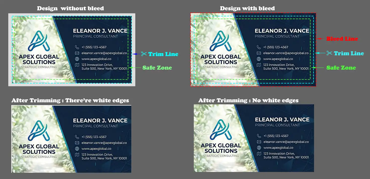
When designing your book cover, achieving a perfect cut exactly on the edge is physically impossible due to slight shifting during the printing and trimming process.
A "bleed" is extra content (typically ⅛ inch / 3mm) that extends beyond the edge of your page. It prevents white slivers from appearing when pages are trimmed. If your design has color, images, or backgrounds that touch the edge of the page, your file must include bleed. Text and important elements should stay at least ¼ inch from the trim edge (the "safe zone").
Providing bleed and respecting safe zones ensures your finished book looks exactly as intended, regardless of minor mechanical slips.
The spine width depends on three key factors: i) type of paper (uncoated, glossy, matte), ii) paper weight in lb., and iii) number of pages.
To get an accurate measurement, we recommend using our Book Width Calculator. Simply enter the paper type, paper weight, and the page coun, and it will instantly calculate the correct spine width for your book.
In design, color modes are defined differently depending on the medium. RGB (Red, Green, Blue) uses light and is used for digital screens. The standard for physical printing, however, is CMYK (Cyan, Magenta, Yellow, Black), which mixes inks on paper.
The critical reason you must use CMYK mode when designing for print is color accuracy. Many vibrant colors visible in RGB mode physically cannot be perfectly reproduced by mixing inks. While most modern conversion is barely noticeable, highly saturated and bright colors—specifically vibrant blues, greens, oranges, and neon shades—are most susceptible to color shift when converting from RGB to CMYK. Because RGB (screen) has a wider color gamut than CMYK (print), these colors often become duller, darker, or "washed out" during conversion.
Designing entirely in CMYK prevents unexpected, muted results, ensuring the color on your finished book is what you intended.
This is a very common issue. In CMYK, a color defined as C=0, M=0, Y=0, K=100 (often called ”100% black“) may look very dark on your screen, but when printed, it can appear slightly gray or washed out - especially in large solid areas.
To achieve a deeper, richer black in print, you should use what’s called a ”rich black.“
Rich black combines black (K) with small amounts of cyan, magenta, and/or yellow to create a deeper, more saturated black.
Common rich black formula: C: 60%, M: 40%, Y: 40%, and K: 100%
Use 100% K black (C=0, M=0, Y=0, K=100): For small text, thin lines, and fine details to ensure sharp edges and avoids registration issues.
Use rich black (e.g., C60 M40 Y40 K100): For large solid areas, backgrounds, and heavy graphics to provide a deeper, more premium-looking black
Our team is ready to help you bring your book to life.
Email Us Today Call (408) 922-0682